


Lloyd Finds His Whalesong: Making the art
An illustration from sketch to final

Back in 2020, my first picture book, Lloyd Finds His Whalesong, was published by Page Street Kids. This project went through a lot of revisions, so today I wanted to walk through the anatomy of a spread to show you how a sketch can develop over time.

Initial sketch
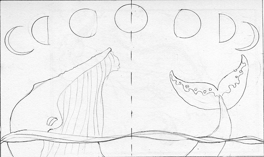
Here is a really early sketch for this page. I knew at this point I wanted to show time passing with the phases of the moons, but I hadn’t really figured anything else out yet, like what actions I wanted to show, or where the text would be (that last bit is kinda important in a picture book, lol).
Revised sketch
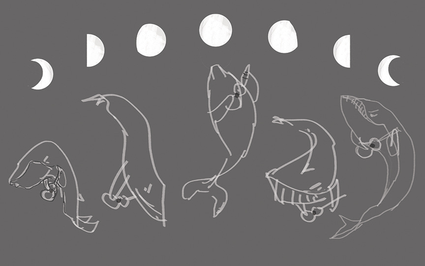
Here we have a new idea for this same page. I flipped the moon phases around and started playing with some action poses for Lloyd to show him diligently practicing his ukulele over time.
Updated concept
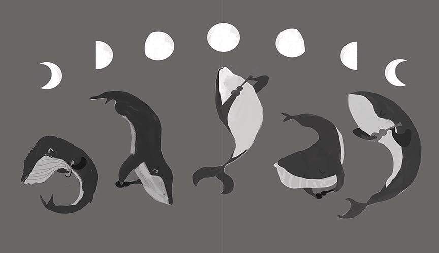
Now I was committed to this composition, so I refined the poses a bit and started adding more values. (Value is just a fancy art word for the darkness/lightness of a color on a spectrum of white to black. Don’t at me with technical specs, artists lol.)
Working in values only with no color can help an artist figure out the composition and define contrasts more. It can also be a faster way to work in a rough phase, but it depends on the artist!
Background time
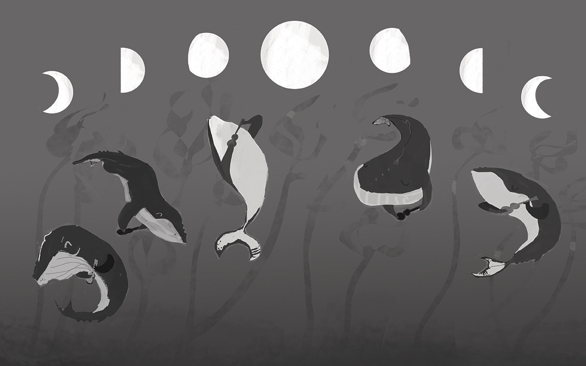
I wanted this spread to have a bit more layer and depth to it, so I added some kelp in the background. (This is an underwater sea environment, after all.)
Uke magic
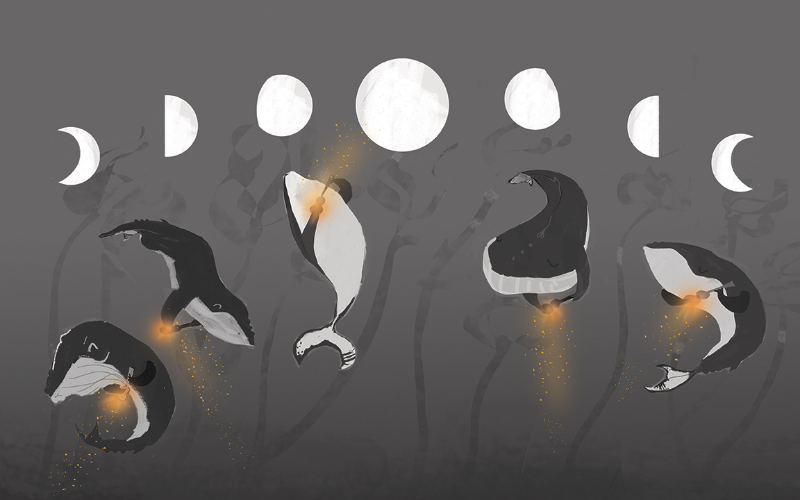
The ukulele is a huge part of the story, so even though I was still in the black-and-white phase at this point, I wanted to figure out what the ukulele magic/music would look like on this spread. I already had the color and texture figured out from other pages, but I added it here to have a clear map and complete idea before I went to full color.
Color
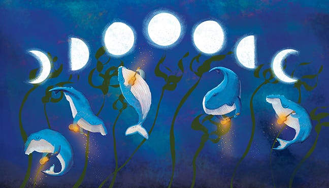
This is the final color image for this spread. I did do some rough colors in between, but I can’t find process shots (lol, a combo of messy file organization and I probably painted over it in Photoshop. Oopsie.)
Final spread
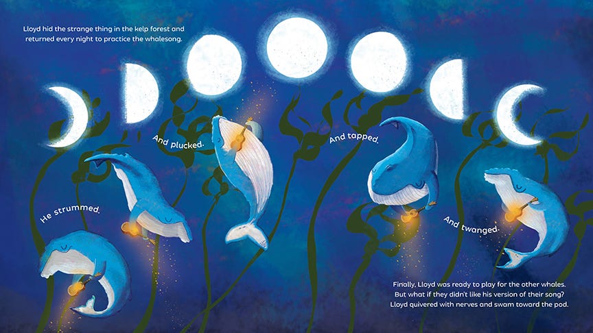
Finally, here’s a look at the final spread as it appears in the book. The designer, Taline Boghosian, did the type layout and had the idea for the playful curved elements, which I really loved.
If you liked seeing this and the book interests you, please subscribe, share my newsletter, or get a copy of Lloyd! These small actions help authors a lot!
Shop talk
I like sharing these process elements and behind-the-scenes stuff of making books, especially because a lot of it was very opaque for me before I got started in the industry. Do you want to see more of this sort of thing? Have a process question? Leave a comment and let me know!